HTML程式碼
執行結果
<head>
<!--Load the AJAX API-->
<script type="text/javascript" src="https://www.gstatic.com/charts/loader.js"></script>
<script type="text/javascript">
// Load the Visualization API and the corechart package.
google.charts.load('current', {'packages':['corechart']});
// Set a callback to run when the Google Visualization API is loaded.
google.charts.setOnLoadCallback(drawChart);
// Callback that creates and populates a data table,
// instantiates the pie chart, passes in the data and
// draws it.
function drawChart() {
// Create the data table.
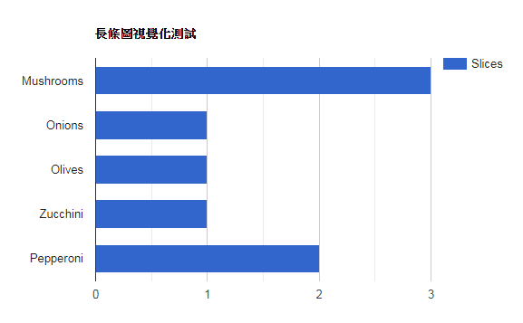
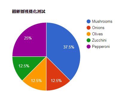
var data = new google.visualization.DataTable();
data.addColumn('string', 'Topping');
data.addColumn('number', 'Slices');
data.addRows([
['Mushrooms', 3],
['Onions', 1],
['Olives', 1],
['Zucchini', 1],
['Pepperoni', 2]
]);
// Set chart options
var options = {'title':'圓餅圖視覺化測試',
'width':600,
'height':400};
// Instantiate and draw our chart, passing in some options.
var chart = new google.visualization.BarChart(document.getElementById('chart_div'));
chart.draw(data, options);
}
</script>
</head>
<body>
<!--Div that will hold the pie chart-->
<div id="chart_div"></div>
</body>
</html>
1. var chart = new google.visualization.BarChart(document.getElementById('chart_div'));
2. var chart = new google.visualization.PieChart(document.getElementById('chart_div'));